
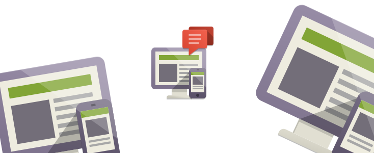
Responsive templates are templates designed to work with any size browser. The term comes from the idea that the website can change it's appearance based on the browser size that is viewing the site.
There is a big move in this direction because of the very dominate use with mobile phones and tablets of the internet. Many major site's already have responsive templates that will work on your iPhone, iPad, Android tablet, Kindle Fire, etc…
What you need to know…
1. Flexibility
Responsive templates give you the ability to change appearances based on browser size. Say if a browser is viewing a website on a screen that is 1200px wide, then it can display it's largest size layout. If it is displaying on an iPhone at 960px by 640px, then it may shrink some images and modules to fit within the display better.
Good templates like, RocketTheme's Kirigami, has about 5 different size settings. This allows for slight variation in size of text, columns and the overall layouts.
2. What Is Responsive Design?
Responsive design is a process and practice. To design using these principles your goal is to make websites 100% compatible with all sorts of viewable sizes. It takes advantage of the latest technology like CSS3 and HTML5 as well as frameworks that people have created as standard for responsive templates.
Without going into too much of the technical stuff about how browsers know what to display, we'll just mention it briefly. Most responsive templates use Media Queries that allow CSS to interact with Javascript to tell the browser what to display based on the size of the browser window.
3. Mobile Internet Usage in the U.S.
According to Pew Research Center, 25% of Americans use their smart phone for most of their internet surfing. That is a pretty big number. If your business resides in a niche that focuses on cell devices or technology, this number could grow exponentially high. Also, this particular study doesn't cover usage with tablets, netbooks or even TV's. Suffice it to say, there are just too many devices NOT to be preparing your website for the multiple size browsers that will view your site.
4. The Future
Many companies that focus on just template design (template clubs) have released their own core frameworks based on responsive design. They know it's the future and have created most (if not all) new templates to be responsive.
5. The Only Drawback
Now, instead of having use one template that looks the same (fixed template) you have to worry about how it will look on every device you think will see your site. This means more testing, more experimenting, and, most important, more time. It will cost more, but the alternative means being left in the dark. Don't worry, these templates are so easy to use, that you will be glad you switched.
Other Template Guides: