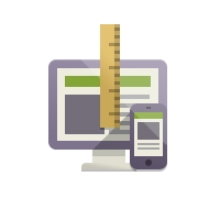
Responsive Templates
 This is our section on responsive templates. These type of templates are going to be how many of the newest themes are developed for many different platforms.
With Joomla, responsive templates means that you will have greater control over the way the templates looks at different sizes. It will have the ability to shrink down to the size of an iPhone or iPad as well as large displays on desktops.
More About Responsive Templates
Top Reasons To Get Responsive Templates
 Over the next few years more and more people will be using tablets and smart phones to surf the internet
- Responsive templates make your website look good at all sizes
- Google expects good websites to have responsive templates and they may increase your ranking
How does a responsive template work?
 Most responsive templates are built with a framework built by the creator. Frameworks help with compatibility, giving the companies a quick starting point to create new and improved templates. The technical way that a responsive template works is with a Javascript CSS integration called Media Queries. It asks the browser what size it is viewing the webpage is at and reacts by moving conditioned items to fill that browser size.

Here at JoomlaHostingReviews.com we are always looking for free Joomla templates, built with high standards. It is not so easy to find the really good ones so we have done that for you! We like to be able to take templates and shape them to suit us, whilst also looking at compatibility, responsive cross-device support, good coding practices and much much more. Enjoy our list below and feel free to leave any comments, including your favourite free Joomla templates for 2016. Read more...


Learn how to prepare your website to be viewed on a retina display. Since retina displays resolution is so much larger, it's important to start designing websites with it in mind. Read more...

See our top responsive templates organized by template clubs. The best templates from Gavick, Joomlabamboo, RocketTheme and others... Read more...

Learn the best way to implement responsive design into your embeded YouTube videos. Most you can solve with a simple addition to the CSS code. Read more...

Learn why responsive templates are the way we will be designing templates in the future. Building responsively gives you greater control over the display of your site without changing core code. Read more...
Get the CSS code that allows you to adjust elements based on browser size. This code is crucial for responsive design. Read more...